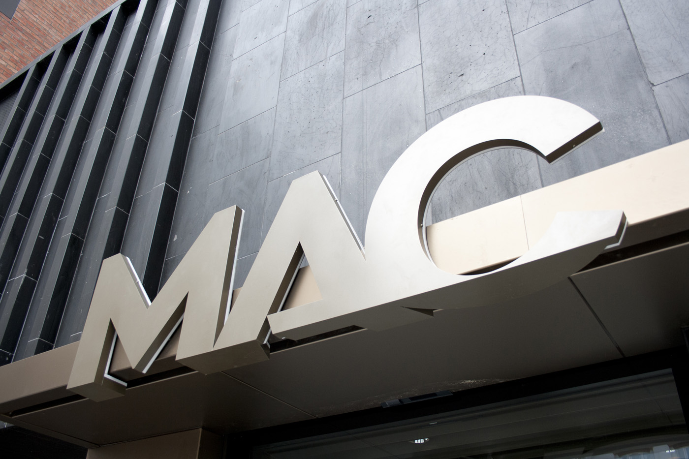
As part of the branding process, the team at The MAC asked us to come with a solution for how the new brand would appear on their new building and still get across the essence of the brand that was evident in the print and marketing collateral. At this stage I was not already involved in the branding process (and as I had done this sort of thing before) I was asked to carry out the task.


All ©2012 AV Browne
Leave a Reply
You must be logged in to post a comment.
