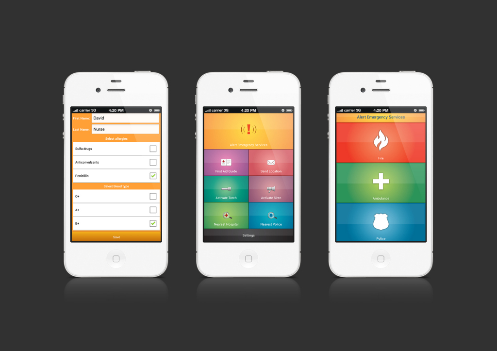
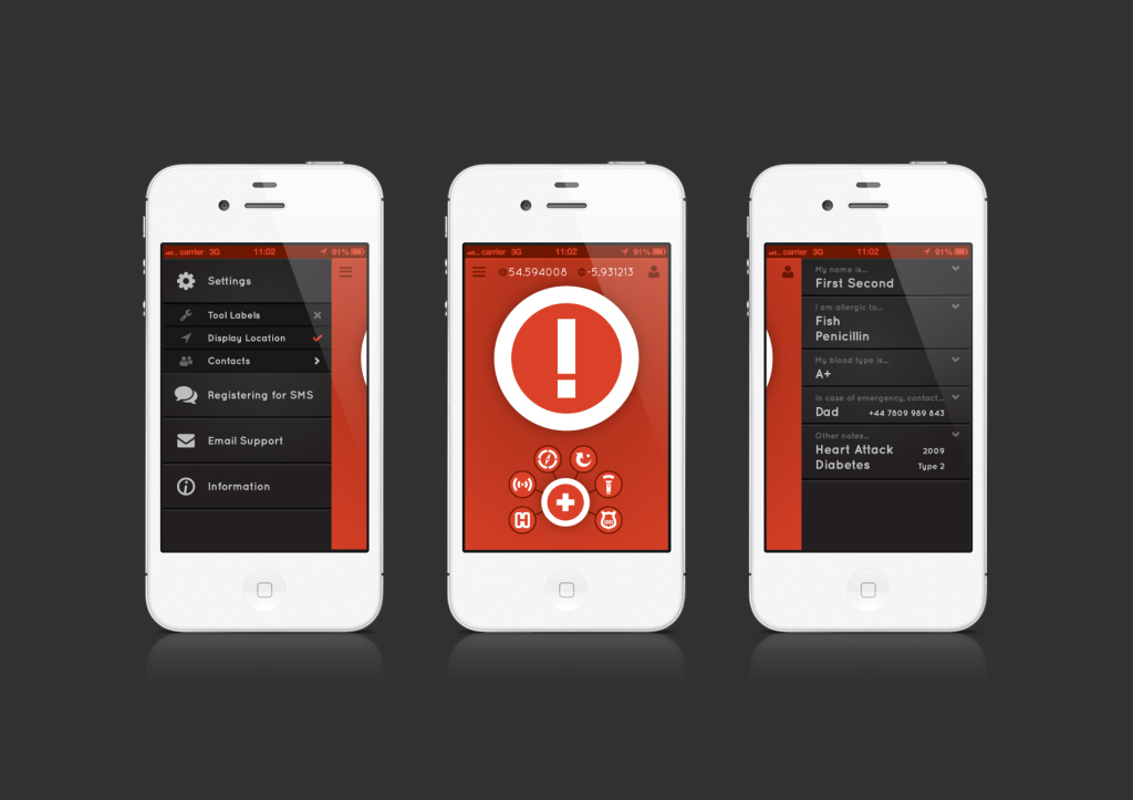
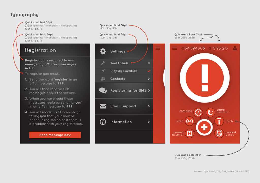
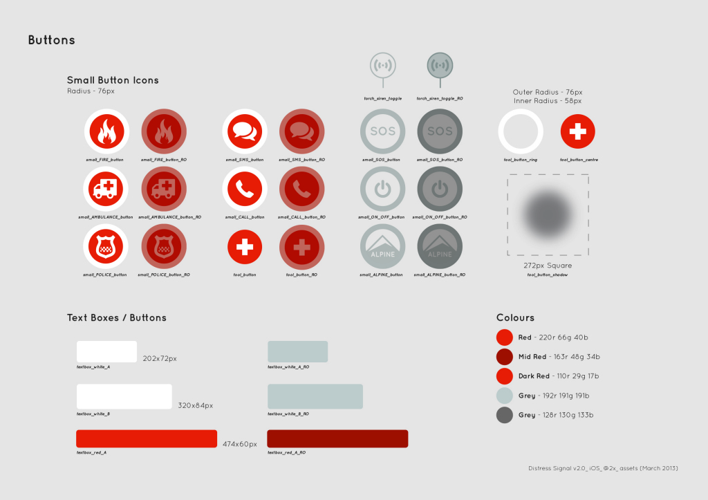
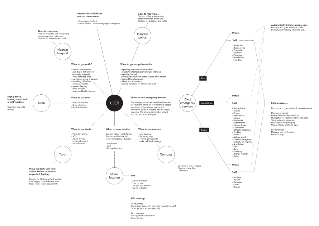
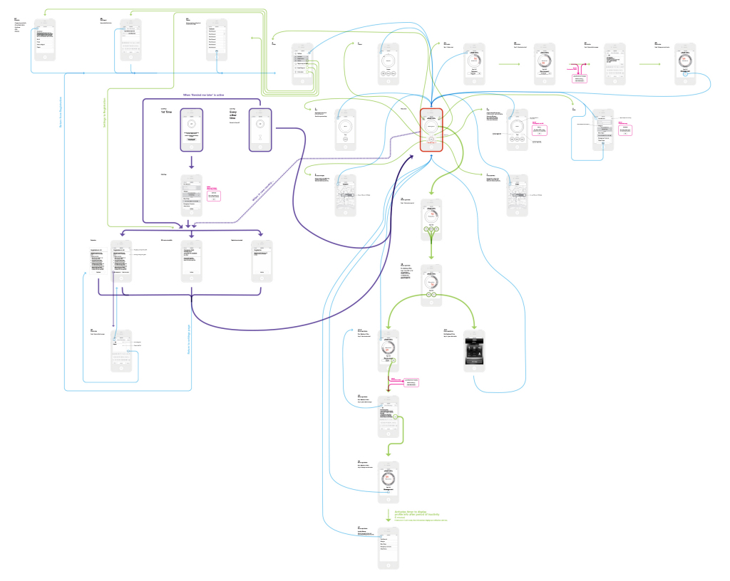
At the end of the end of 2012, start of 2013 I got the opportunity to redevelop the Distress Signal app. Independently developed by David Nurse in 2011/2012, version 1 of the app was available on the Apple app store. Working with David, we analysed every part of the app. What worked, what didn’t. How it was built. How it looked. How it functioned and responded. Then we set about mapping v1 and overlaying our improvements to create a series of UI and UX maps. These in turned informed the content of every screen and a keyline design map was created. There are many screens in this app and within each screen many elements. Each was considered and designed to fit the scheme and suit their specific function. To aid the developer, each element was then separated and given it’s own specification – position, size, colour reference and typeface if applicable.
All of the processes in this project where intensive, but necessary, to ensure a functional and well designed app. I’m very pleased with how it turned out and it was great to be able to influence every aspect of the process. Since the v2 of the iOS app was developed, an Android version has been released also – more info available here.

